 CryptoChain Blog
Introduction to Bitcoin Halving Cycles and 2026 Signals
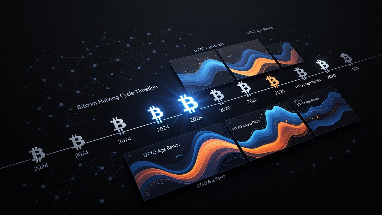
The Bitcoin halving mechanism reduces the block reward by half every 210,000 blocks, creating predictable scarcity that has historically driven major market cycles. With the 2024 halving already complete, attention turns to preparing for the 2028 event through advanced on-chain analysis throughout 2026. Historical patterns show that supply shocks often build years in advance, driven by holder behavior, reduced new issuance, and shifts in coin distribution across the network.
Understanding these dynamics helps traders and investors anticipate volatility and position themselves effectively. On-chain metrics provide transparent data unavailable in traditional markets, revealing shifts in coin distribution, age, and economic activity. In 2026, focusing on these indicators allows market participants to identify early signs of tightening supply that could amplify price movements leading into the next halving.
Historical Halving Patterns and Their Relevance
Each halving cycle has followed a similar trajectory: initial price appreciation post-event, followed by accumulation phases lasting 12 to 18 months. The 2012, 2016, and 2020 halvings demonstrated that supply tightening correlates with multi-year bull markets, often peaking 12 to 18 months after the halving itself. In 2026, analysts monitor similar indicators to forecast the next cycle peak around 2029-2030, using past data as a framework rather than a guarantee.
Key lessons include monitoring long-term holder activity, as coins moving from dormant wallets often precede major moves. Comparisons to prior cycles reveal that early cycle signals in the year before a halving can indicate accumulation strength, with 2026 data showing accelerated migration to older age bands compared to previous periods. This pattern suggests institutional and retail holders are adopting longer-term strategies earlier in the cycle.
UTXO Age Bands and Scarcity Indicators
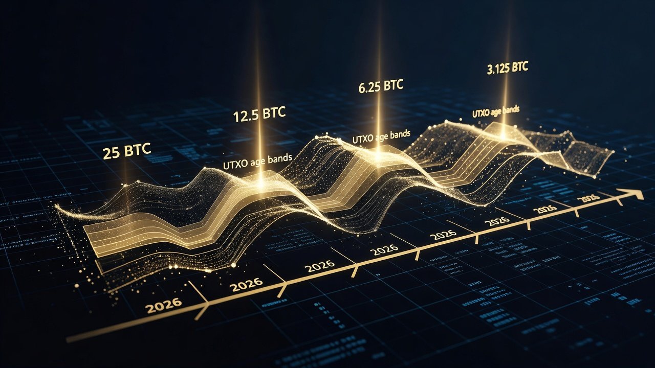
UTXO age bands track the distribution of unspent transaction outputs by age, highlighting when coins are held long-term versus actively traded. In 2026, rising percentages in the 1+ year bands signal strong holder conviction and reduced liquid supply available for immediate sale. These bands are divided into cohorts such as 1 day to 1 week, 1 month to 3 months, and 1 year or more, providing granular insight into market behavior.
Custom dashboards on platforms like Glassnode allow filtering by age cohorts. For example, a surge in 3+ year UTXOs often precedes supply shocks by indicating coins that have remained untouched through multiple price swings. This metric complements realized price data to confirm trends and helps differentiate between temporary dips and structural changes in supply.
Realized Cap Shifts and Market Valuation
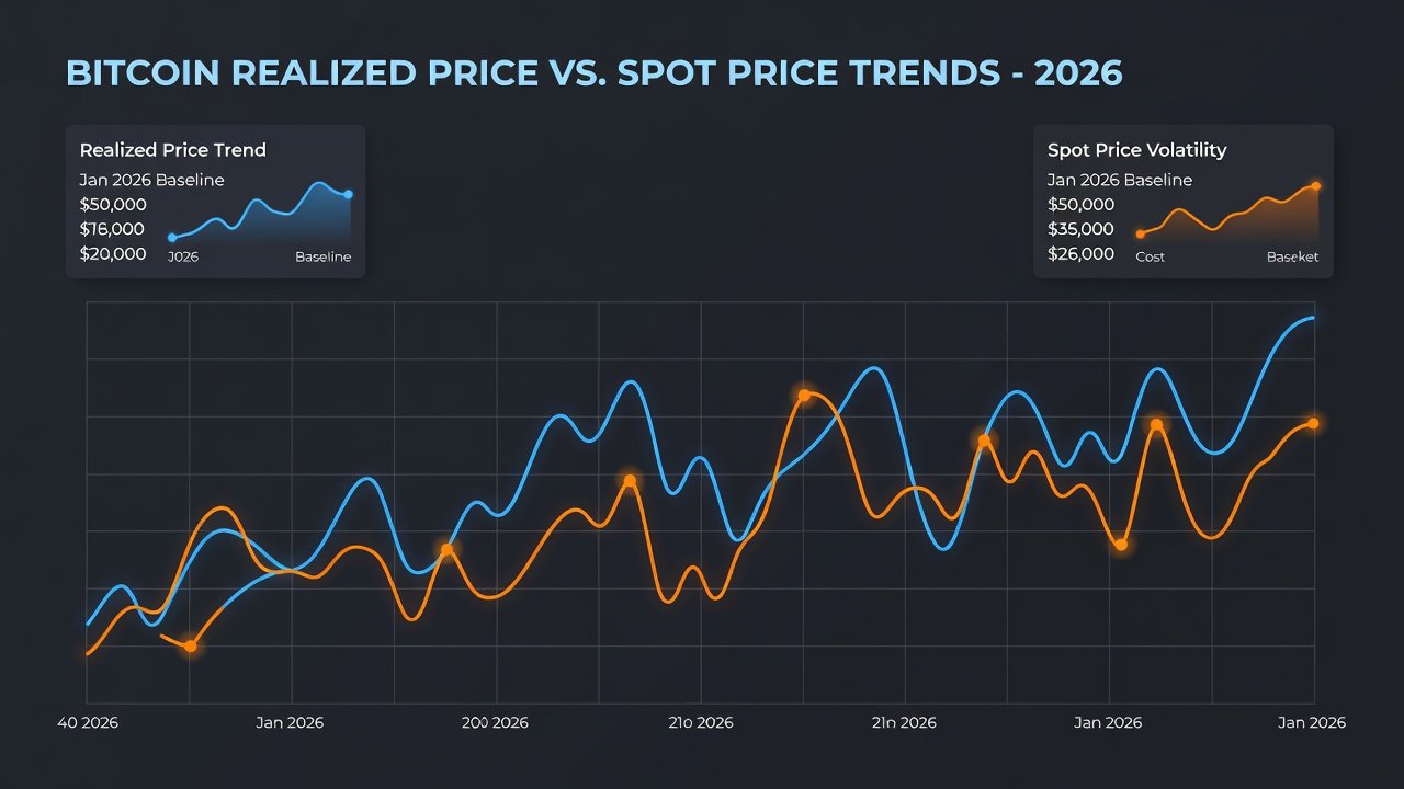
Realized capitalization measures the value of coins at their last on-chain movement price, offering a more accurate view of economic activity than market cap alone. Shifts in realized cap during 2026 can reveal whether new demand is absorbing the reduced issuance post-2024 halving, providing a clearer picture of underlying network health.
Positive divergence between realized cap and price often marks healthy accumulation phases, while negative divergences may warn of distribution. Traders use these shifts to gauge whether supply is truly tightening ahead of 2028, incorporating realized cap into broader models that factor in exchange reserves and miner behavior for comprehensive analysis.
Setting Up Custom Dashboards for Tracking Scarcity
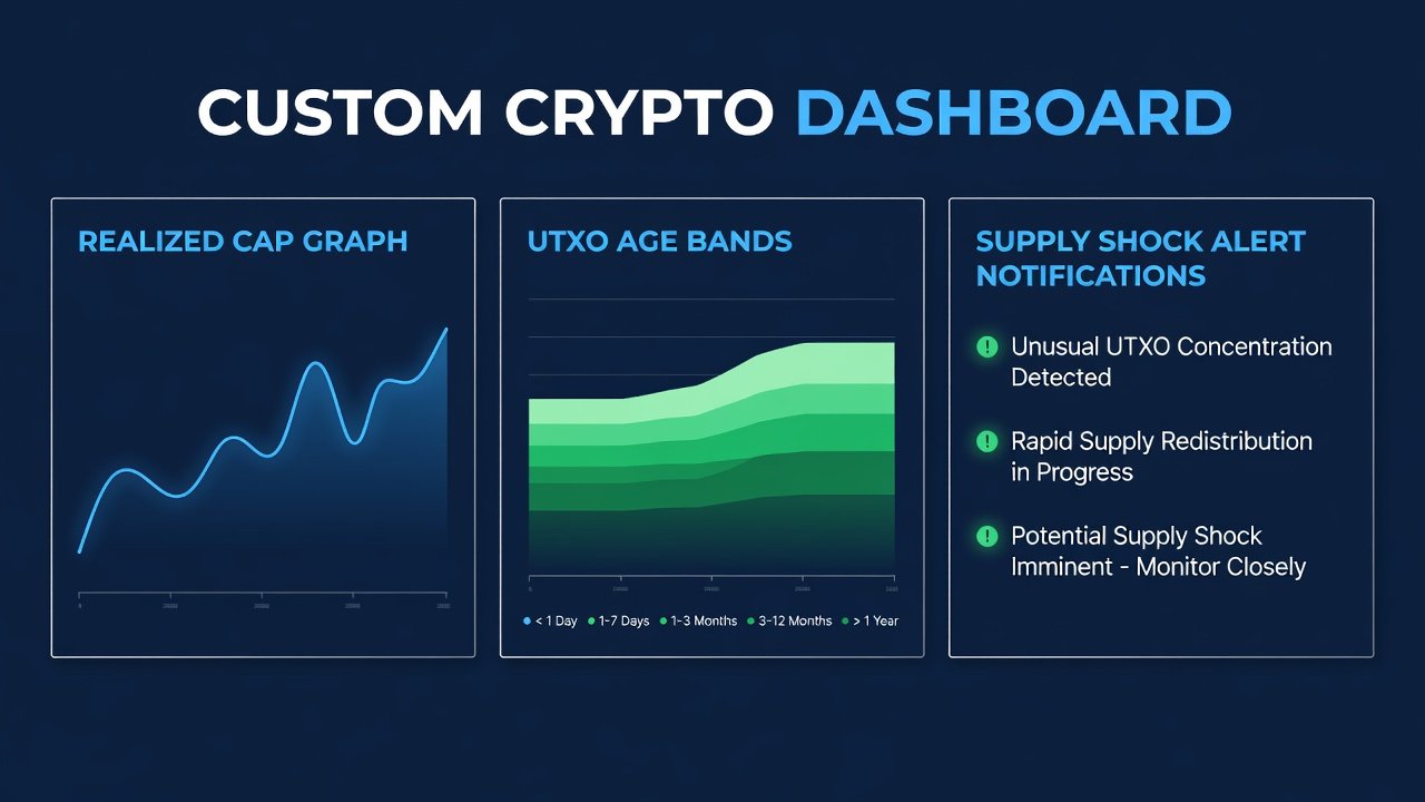
Building a dashboard involves selecting key metrics: UTXO age bands, realized cap, and exchange reserves. Start by connecting to on-chain data providers and creating alerts for threshold breaches, such as a 5% monthly increase in long-term held coins. Advanced users can layer in additional data points like miner reserves and whale wallet movements to create multi-signal views.
Step-by-step: 1) Choose a platform with API access. 2) Define queries for age bands and realized cap. 3) Set notification rules for anomalies like sudden outflows. 4) Integrate visualizations for quick scanning. 5) Test the dashboard against historical data from 2019-2020. 6) Refine thresholds based on backtesting results. This setup enables proactive monitoring throughout 2026 and reduces reaction time during volatile periods.
Building Alerts for Potential Supply Shocks
Supply shock alerts focus on metrics like dormant coin activation or exchange outflows. Example: Configure an alert when coins aged over 2 years exceed a historical average by 10%. Combine with volume filters to avoid false positives and ensure alerts trigger only on meaningful movements. Another practical setup involves monitoring the ratio of coins held for over one year versus total supply, with thresholds set at levels observed before previous cycle tops.
Practical example: In a dashboard, query for UTXO bands shifting from 6-12 months to 1-2 years. Test alerts against past cycle data for accuracy before live deployment, adjusting sensitivity to account for market noise. Users should also incorporate multi-metric confirmation, such as requiring both age band shifts and realized cap growth before an alert fires.
Comparisons to Prior Cycles
Comparing 2026 data to 2015-2016 and 2019-2020 reveals parallels in accumulation speed. Current on-chain behavior shows faster migration to long-term bands than previous cycles, suggesting a stronger holder base supported by improved custody solutions and institutional participation. However, differences in institutional involvement add new variables, including ETF flows and corporate treasury allocations that were absent in earlier cycles.
These comparisons highlight that while core patterns persist, the scale and speed of supply shocks may differ. Analysts recommend weighting 2026 metrics against both historical norms and emerging factors like regulatory developments to build more robust forecasts.
Integration with Perpetual Futures Data
Perpetual futures funding rates and open interest provide leverage context to on-chain signals. When on-chain supply tightens coincide with elevated funding rates, it may indicate over-leveraged positions vulnerable to shocks. Cross-reference exchange flows with futures data for comprehensive views that reveal whether spot market scarcity is being amplified or offset by derivatives activity.
This integration allows traders to identify divergences, such as rising on-chain accumulation paired with negative funding rates, which can signal healthy deleveraging. Authoritative resources include Bitcoin.org for protocol fundamentals, Glassnode for advanced metrics, and Chainalysis for clustering methodologies.
Address Clustering for Deeper Trader Insights
Address clustering groups wallets likely controlled by the same entity, revealing whale movements or exchange behavior. In 2026, clustering analysis helps distinguish organic accumulation from coordinated selling pressure, especially when applied to large UTXO movements. This technique filters out noise from individual addresses and provides entity-level visibility into supply dynamics.
Apply clustering to UTXO data to refine supply shock predictions. For instance, identifying clusters associated with long-term holders versus exchanges can improve the accuracy of alerts during volatile periods by confirming whether outflows represent genuine distribution or internal transfers.
Common Mistakes to Avoid in On-Chain Analysis
Traders often overlook confirmation bias when interpreting metrics, such as focusing only on bullish signals during uptrends. Another frequent error is ignoring lag in on-chain data, which can trail price action by days or weeks. Always cross-validate with multiple sources and maintain a disciplined approach to threshold setting to prevent overreaction to short-term fluctuations.
Practical FAQs on Risk Management and Indicator Accuracy
- How accurate are on-chain indicators during volatility? They provide leading signals but require confirmation with price action; false positives occur in low-volume periods and should be validated with volume and futures data.
- What risk management steps apply? Diversify holdings across multiple assets, set stop-losses based on realized cap levels, and avoid over-leveraging on futures during uncertain accumulation phases.
- Can dashboards predict exact halving outcomes? No, they highlight probabilities; combine with macroeconomic analysis and sentiment indicators for better results.
- How often should alerts be reviewed? Review and recalibrate thresholds monthly to account for evolving market conditions and new data patterns observed in 2026.
- What role does address clustering play in risk assessment? It reduces false signals by grouping related wallets, allowing clearer identification of genuine supply movements versus internal transfers.
Conclusion
Preparing for the 2028 Bitcoin halving starts with diligent 2026 on-chain monitoring. By mastering UTXO analysis, realized cap, alerts, and integrated data sources, participants position themselves for informed decisions amid evolving supply dynamics. Consistent application of these tools throughout the year builds the foundation for navigating the next cycle with greater confidence.
No comments yet. Be the first!