 CryptoChain Blog
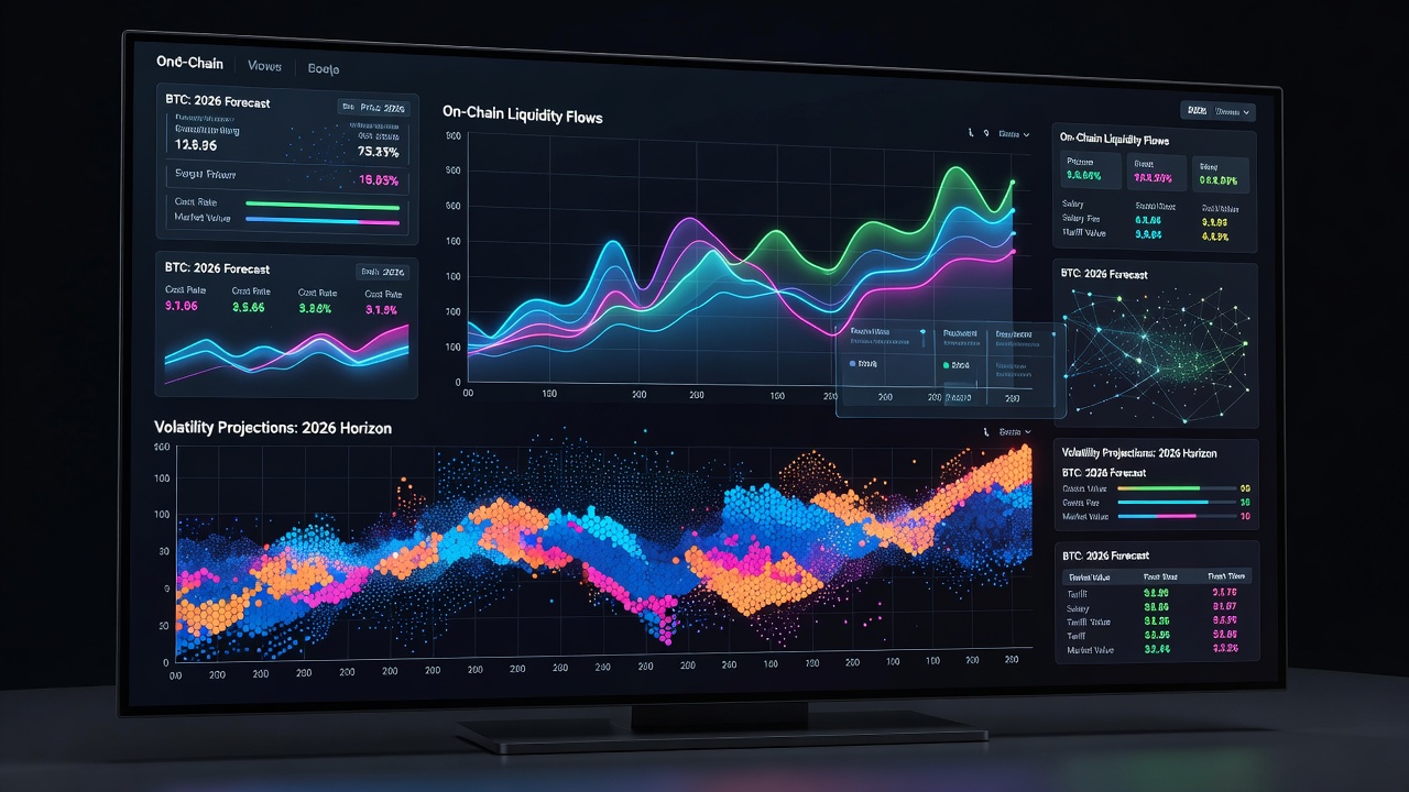
Introduction to Bitcoin Data Visualizations in 2026
Bitcoin analysis has evolved significantly by 2026, requiring traders, analysts, and researchers to transform raw on-chain data, market metrics, and volatility indicators into clear, actionable visuals. Effective visualizations go beyond simple price charts to reveal hidden patterns in transaction flows, network activity, and sentiment shifts that directly influence trading strategies. This comprehensive guide focuses on advanced yet practical methods for creating decision-driving visuals, emphasizing search intent around bitcoin analysis and btc analysis. Readers will learn how to select tools, choose meaningful metrics, build specific chart types like heatmaps and overlays, review real case studies, and avoid common presentation errors.
Selecting the Right Tools for BTC Visualizations
Choosing appropriate libraries and platforms forms the foundation of any successful visualization project. Python stands out for its ecosystem that handles large blockchain datasets efficiently. Core libraries include Matplotlib for creating publication-quality static plots, Seaborn for elegant statistical graphics, and Plotly for building interactive web-based dashboards that allow zooming and filtering. For those preferring no-code or low-code options, dashboard platforms like Tableau enable drag-and-drop integration with Bitcoin APIs, while Grafana offers real-time monitoring capabilities when connected to time-series databases.
Setting up begins with installing Python and the required packages. Users connect to public data endpoints from blockchain explorers to pull metrics such as block height or mempool size. Authoritative resources such as the Python official site provide installation guides, while Matplotlib documentation offers detailed plotting tutorials. Comparing options reveals trade-offs: Matplotlib excels in customization but requires more code, whereas Plotly reduces development time for interactive outputs suitable for 2026 trading desks.
Key Metrics to Visualize for Effective Analysis
Selecting the right metrics separates superficial charts from powerful analytical tools. On-chain flows, including exchange inflows and outflows, indicate potential accumulation phases or sell pressure before price movements occur. Volatility metrics, derived from rolling standard deviations of returns, help quantify risk and identify regime changes in market behavior. Additional valuable indicators encompass active address counts for network adoption trends, hash rate for security and miner sentiment, and transaction volume segmented by size to distinguish retail from institutional activity.
These metrics provide context that price data alone cannot deliver. In btc analysis, combining flows with volatility in a single dashboard allows correlation spotting that improves entry and exit timing. Normalization techniques ensure metrics with different scales remain comparable across visualizations.
Step-by-Step Guide to Building Heatmaps
Heatmaps deliver exceptional clarity when displaying correlations or time-based intensity of multiple variables. Follow this expanded workflow using Python libraries:
- Import pandas for data manipulation and seaborn or plotly for rendering.
- Fetch or load historical BTC datasets covering at least twelve months of on-chain and price data.
- Calculate derived statistics such as 7-day and 30-day rolling correlations between selected metrics.
- Apply seaborn.heatmap with annotated values and a diverging color palette to highlight positive versus negative relationships.
- Customize annotations, axis labels, and titles for professional presentation, then export in high-resolution formats.
This method converts dense numerical tables into intuitive color patterns that traders can scan quickly. 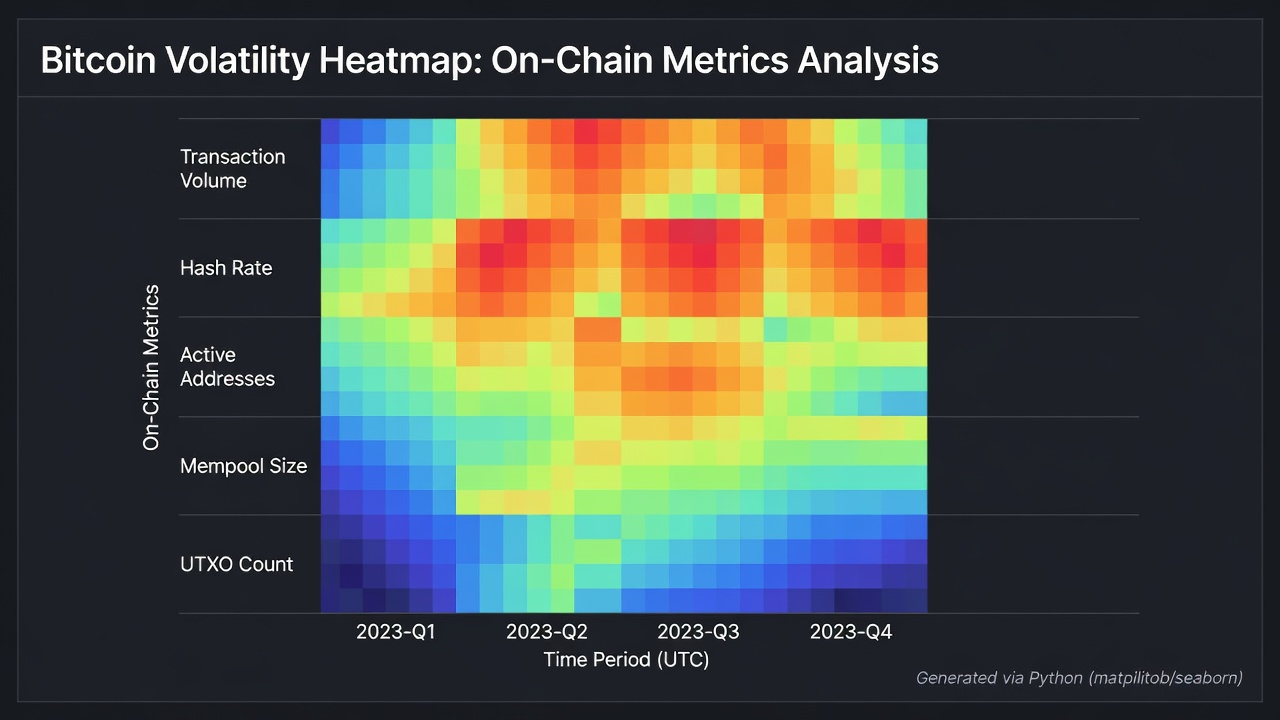
Creating Trend Overlays for BTC Analysis
Trend overlays layer multiple series to expose divergences and convergences invisible in single-line charts. Using Plotly, analysts can superimpose moving averages of on-chain volume over price action or volatility bands around hash rate trends. A practical example involves plotting 50-day and 200-day moving averages of exchange net flows alongside Bitcoin price, highlighting periods where outflows accelerate ahead of rallies.
Advanced overlays incorporate dual y-axes for metrics with mismatched units. Adding confidence intervals around trend lines provides visual context for uncertainty, essential during high-volatility windows common in cryptocurrency markets.
Real-World Case Studies from Recent Market Events
Case studies illustrate the tangible value of these techniques. In early 2025 volatility episodes, analysts applied correlation heatmaps to detect unusual clustering between large outflows and rising funding rates, enabling preemptive position adjustments. Another instance during a hash rate contraction showed that overlaying difficulty adjustments with transaction fee heatmaps revealed miner capitulation signals days before broader market recognition.
These examples underscore how visuals accelerate insight compared with raw data review. Teams that adopted interactive dashboards reported faster identification of regime shifts, directly supporting improved risk management in btc analysis workflows.
Common Pitfalls and How to Avoid Them
Even experienced practitioners encounter issues that undermine visualization effectiveness. Overloading a single chart with five or more metrics leads to cognitive overload; restrict visuals to three core variables maximum. Failing to normalize data before comparison distorts relationships, so always apply min-max scaling or z-score transformations. Choosing non-colorblind-friendly palettes excludes part of the audience, while static-only outputs limit exploration in collaborative 2026 environments.
Additional pitfalls include neglecting axis scaling consistency across related charts and omitting source citations. Mitigation involves creating reusable style templates and conducting peer reviews before publishing dashboards.
Advanced Techniques and Best Practices
Beyond basic charts, consider network graphs for visualizing wallet connections or candlestick overlays with volume profiles. Real-time data pipelines using WebSocket feeds keep dashboards current. Best practices recommend versioning datasets, documenting color meanings in legends, and testing visuals on multiple screen sizes. These steps ensure visuals remain reliable decision tools throughout dynamic market conditions.
FAQ
What Python libraries work best for Bitcoin visualizations?
Matplotlib, Seaborn, and Plotly offer robust options for creating heatmaps and overlays from BTC data, with Plotly favored for interactivity.
How do on-chain metrics improve trading decisions?
They provide transparency into network activity, helping predict sentiment shifts beyond price action alone and reducing reliance on lagging indicators.
Are there free tools for beginners?
Yes, Python with open libraries and public Bitcoin data sources allow cost-effective starts without paid subscriptions.
Which metrics should be prioritized in 2026?
Focus first on exchange flows, volatility, and hash rate, then expand to active addresses and fee trends as familiarity grows.
How often should visualizations be updated?
Daily refreshes suit most trading workflows, while intraday updates benefit high-frequency strategies during volatile periods.
Conclusion
Mastering these visualization techniques equips analysts with clearer insights for bitcoin analysis throughout 2026. By focusing on relevant metrics, iterative tool use, and structured presentation, professionals can build visuals that directly support superior trading outcomes and deeper market understanding.


No comments yet. Be the first!