 CryptoChain Blog

Cross-Chain Token Flows: 2026 Onchain Tokenomics Breakdown
In 2026, cross-chain token flows have become central to evaluating token economics. Onchain analytics now provide granular visibility into how tokens move between blockchains, revealing the health of liquidity, usage velocity, and overall design sustainability. This breakdown examines the key metrics, patterns, and methods analysts use to distinguish robust tokenomics from fragile setups. Readers gain practical frameworks for interpreting transaction data and optimizing protocol designs in an increasingly interconnected ecosystem.
Understanding Cross-Chain Token Flows in 2026
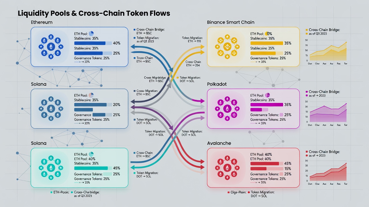
Token flows across chains occur primarily through bridges, wrapped assets, and interoperable protocols. Analysts track these movements to assess whether tokens are being used productively or merely shuttled in speculative loops. Healthy flows typically show consistent volume tied to real utility such as lending, trading, or staking, while risky patterns include rapid inflows followed by abrupt outflows without corresponding activity. In 2026, the maturation of layer-2 networks and new interoperability standards has multiplied the number of viable pathways, making comprehensive tracking essential for any serious tokenomics evaluation. Understanding these flows requires combining raw transaction logs with contextual signals like wallet behavior and protocol incentives.
Bridge Activity Metrics
Bridge activity forms the foundation of cross-chain analysis. Key indicators include daily transaction counts, average transfer sizes, and the ratio of inbound versus outbound volume. High bridge throughput paired with low retention on the destination chain often signals short-term arbitrage rather than organic adoption. Tools like onchain dashboards allow filtering by asset type to isolate stablecoin movements from native tokens. Analysts also monitor failed transaction rates and average confirmation times, which highlight operational friction. For instance, a protocol experiencing a surge in 10,000-plus daily bridge transactions alongside stable retention rates demonstrates stronger fundamentals than one with similar volume but 80 percent immediate reversals. Practical evaluation starts with comparing bridge TVL changes against total chain TVL. Sustained growth in both suggests effective capital migration; divergence points to potential inefficiencies that warrant deeper investigation into incentive structures.
Liquidity Distribution Patterns
Liquidity distribution reveals where tokens concentrate and how readily they can be deployed. Analysts examine pool depths across decentralized exchanges on multiple chains and monitor concentration ratios. When liquidity clusters heavily on one chain while remaining thin elsewhere, slippage risks rise during large transfers. Patterns worth watching include seasonal migration tied to yield farming cycles and persistent imbalances between major ecosystems such as Ethereum and its layer-2 networks. Balanced distribution across three or more chains generally indicates stronger resilience. In practice, teams review heat maps of liquidity concentration to identify over-reliance on a single venue. This analysis helps forecast how a token might behave during market stress when liquidity providers withdraw simultaneously across bridges.
Velocity Indicators Derived from Blockchain Data
Velocity measures how frequently a token changes hands. Onchain data calculates this by dividing total transfer volume by circulating supply over a given period. Elevated velocity across bridges can indicate speculative behavior, whereas moderate velocity combined with rising active addresses points to genuine utility growth. Step-by-step method: First aggregate transfer events from bridge contracts, then normalize by unique wallet counts. Compare results month-over-month to detect acceleration or deceleration trends. Additional nuance comes from segmenting velocity by holder cohort; large holders exhibiting high velocity often reflect internal treasury movements rather than organic demand. Incorporating time-decayed velocity metrics helps smooth outliers caused by one-off events such as airdrops or governance votes.
Case Studies from Leading Protocols
Consider a major decentralized exchange protocol operating on Ethereum, Arbitrum, and Optimism. In early 2026, its bridge inflows correlated strongly with increased trading volume rather than idle holdings, demonstrating efficient capital use. Detailed transaction mapping showed that 65 percent of bridged tokens participated in liquidity provision within 48 hours. Another example involves a lending protocol where tokens migrated rapidly to a new chain but velocity remained low, highlighting over-reliance on temporary incentives. In that case, retention dropped sharply after reward emissions ended, revealing a design flaw that future iterations addressed by introducing cross-chain staking penalties. These real-world patterns underscore the importance of pairing volume data with post-transfer behavior analysis.
Step-by-Step Analysis Methods Using Available Tools
- Export bridge transaction data from public explorers and normalize timestamps across chains.
- Map wallet clusters to identify repeat cross-chain actors and label them by behavior type.
- Calculate retention rates by tracking addresses that remain active 30 days post-transfer.
- Overlay liquidity depth metrics from multiple DEX aggregators to spot thin pools.
- Visualize velocity trends with time-series queries segmented by asset and chain.
- Cross-reference bridge events with governance proposals to detect coordinated migrations.
- Run cohort analysis on new wallets to distinguish organic users from mercenary capital.
- Generate comparative dashboards across protocols to benchmark against industry averages.
Identifying Healthy Versus Risky Cross-Chain Designs
Healthy designs feature diversified bridge providers, transparent upgrade mechanisms, and incentives aligned with long-term holding. Risky designs often rely on single bridges, exhibit extreme concentration in a few wallets, and show velocity spikes without corresponding address growth. Real transaction patterns—such as repeated round-trip transfers within hours—serve as early warning signals. Additional red flags include sudden volume spikes coinciding with social media campaigns but lacking onchain utility evidence. Teams that implement multi-bridge redundancy and publish regular transparency reports tend to maintain healthier flow dynamics over time.
Comparisons of Efficiency Gains
Cross-chain designs deliver efficiency gains through reduced fragmentation when properly implemented. Protocols that maintain consistent liquidity pools across ecosystems achieve lower effective spreads compared with siloed deployments. Ethereum Foundation resources highlight how layer-2 scaling combined with secure bridges improves throughput while preserving security guarantees. In contrast, fragmented liquidity leads to higher costs and slower execution, reducing overall token utility. When comparing designs, analysts also review gas cost differentials and finality times across chains; these operational metrics directly influence whether users choose to bridge or remain on a single network. Polkadot network documentation further illustrates how shared security models can enhance cross-chain capital efficiency when liquidity incentives are calibrated correctly.
Common Data Interpretation Challenges and FAQs
How do analysts account for wrapped token inflation?
Wrapped assets require separate supply tracking on each chain to avoid double-counting velocity. Analysts maintain chain-specific ledgers and apply netting rules before aggregating global metrics.
What timeframe provides the most reliable signals?
Sixty- to ninety-day rolling windows smooth out short-term noise while capturing meaningful trends. Shorter windows can be useful for tactical alerts but often produce false positives during volatility spikes.
Can bridge failures distort tokenomics readings?
Yes. Sudden bridge pauses create artificial volume drops that must be contextualized with onchain event logs. Analysts flag these periods and exclude them from trend calculations when appropriate.
How should teams handle data from low-activity chains?
Low-activity chains benefit from longer observation periods and peer benchmarking to prevent over-interpretation of sparse datasets.
Is it possible to predict capital flight using velocity alone?
Velocity serves as one indicator but performs best when combined with retention rates and liquidity depth to produce actionable early warnings.
By combining bridge metrics, liquidity mapping, and velocity analysis, participants can optimize tokenomics strategies and avoid designs prone to rapid capital flight. Continued refinement of these methods will remain essential as interoperability expands throughout 2026 and beyond, empowering protocols to build more resilient economic models grounded in transparent onchain evidence.
No comments yet. Be the first!