 CryptoChain Blog

Introduction to Token Incentive Evaluation in 2026
Token incentive models remain central to DeFi growth, but distinguishing sustainable designs from hype-driven ones requires rigorous onchain analysis. In 2026, builders and investors increasingly rely on blockchain data to assess whether incentives drive genuine economic activity or merely temporary speculation. This guide provides a practical framework for evaluating these models through holder behavior, transaction patterns, and retention metrics. Onchain analytics allow transparent measurement of economic health across public ledgers, moving beyond surface-level metrics like total value locked.
Effective evaluation starts with understanding that incentives should align long-term value creation rather than short-term liquidity spikes. Poorly designed programs often lead to rapid capital flight once rewards diminish, leaving protocols with depleted treasuries and eroded trust. By focusing on data from the blockchain itself, participants can identify warning signs early and favor models that promote organic usage and community alignment.
Understanding Token Incentive Models
Token incentives typically include liquidity mining, staking rewards, airdrops, and yield farming programs. Each mechanism distributes tokens to encourage specific behaviors such as providing liquidity or locking assets. In 2026, successful programs incorporate vesting schedules, emission caps, and utility requirements to prevent immediate sell pressure. Onchain data reveals how these features influence participant actions over time, offering insights unavailable through marketing materials alone.
Core Onchain Metrics for Incentive Assessment
Successful token programs exhibit predictable onchain signatures. Key metrics include holder distribution and concentration, transaction velocity, retention cohorts, and net flow analysis. Holder distribution tracks wallet concentration ratios to detect whale dominance that may signal unsustainable farming. Transaction velocity measures how frequently tokens change hands relative to total supply, revealing whether incentives encourage productive use or rapid dumping. Retention cohorts analyze wallet activity over 30-, 60-, and 90-day windows to quantify stickiness beyond initial reward claims. Net flow analysis compares inflows from incentive programs against organic usage metrics such as protocol revenue and unique active addresses. These indicators together paint a clearer picture than headline TVL figures alone.
Step-by-Step Framework for Analysis
Follow this repeatable process when reviewing any token incentive program. First, identify the incentive mechanism and its distribution schedule using contract data and governance records. Second, segment participants by wallet age and behavior clusters using analytics tools to separate farmers from long-term holders. Third, calculate velocity ratios and compare against similar protocols launched in the prior year. Fourth, model retention curves and project decay rates under different market conditions. Fifth, cross-reference onchain signals with offchain governance proposals for alignment. This structured approach reduces reliance on narrative and surfaces data-backed red flags early. Additional steps involve stress-testing against historical market downturns and monitoring for sybil attack patterns through address clustering.
Analyzing Holder Behavior with Onchain Data
Holder behavior provides direct evidence of incentive effectiveness. Examine the proportion of tokens held in smart contracts versus individual wallets, as high contract concentration may indicate automated farming bots. Track large transfers immediately following distribution events to identify dumping activity. In 2026, tools allow filtering out known exchange wallets and mixers for cleaner insights. Builders should monitor the emergence of new addresses claiming rewards repeatedly, which often points to incentive gaming rather than genuine adoption.
Transaction Velocity Patterns and Their Implications
Velocity patterns serve as a leading indicator of sustainability. Low to moderate velocity suggests tokens are being held for utility or long-term staking, while spikes often precede collapses in participation. Compare velocity across different incentive phases, such as before and after emission reductions. Protocols that maintain stable velocity despite changing reward rates demonstrate stronger product-market fit. Onchain explorers and dashboards help visualize these trends through time-series graphs, enabling precise comparisons between competing DeFi projects.
Measuring Retention Metrics via Blockchain Analytics
Retention is perhaps the most critical long-term signal. Calculate cohort retention by tracking the percentage of wallets that remain active after specific periods. Effective models show gradual decay rather than sharp drop-offs. Combine retention data with engagement metrics like transaction frequency per wallet to distinguish passive holders from active users. This dual approach highlights whether incentives foster a vibrant ecosystem or merely attract transient capital.
Real-World DeFi Examples from 2026
Consider two contrasting cases observed in early 2026. One lending protocol implemented tiered liquidity mining with vesting cliffs, resulting in stable holder retention above 65% after 90 days and consistent transaction velocity around 4.2x monthly. In contrast, a yield aggregator with uncapped emissions saw velocity spike above 18x within weeks, followed by rapid cohort attrition as rewards tapered. A third example involves a decentralized exchange that introduced utility-based staking tied to fee sharing; onchain data showed improved retention and diversified holder bases compared to pure emission models. These outcomes underscore the importance of vesting mechanics, emission caps, and utility linkages in maintaining healthy onchain economics.
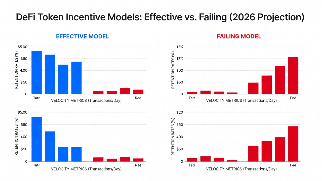
Comparing Effective and Failing Models
Effective models typically feature declining emission schedules, meaningful staking requirements, and utility-linked rewards. Failing programs often rely on perpetual high APYs without corresponding demand drivers, leading to sell pressure visible in large outbound transfers shortly after distribution events. Side-by-side analysis reveals that successful protocols maintain balanced supply dynamics even during volatility, while failing ones experience rapid token distribution followed by sharp price declines. Comparative dashboards on platforms like Dune allow visualization of these patterns across protocols, helping users identify transferable best practices.
Recommended Tools and Platforms for Onchain Analytics
Several established platforms support detailed incentive evaluation. DefiLlama provides protocol-level metrics including velocity and retention proxies. Dune Analytics enables custom queries for granular wallet-level insights. Additional options include Etherscan for raw transaction data and specialized services for cohort analysis. Combining multiple sources reduces blind spots and improves decision accuracy.
Common Pitfalls and How to Avoid Them
Investors frequently misread short-term liquidity surges as success. Always examine underlying address diversity and filter out known exchange and mixer activity. Builders should stress-test incentive designs against historical data from similar launches rather than assuming perpetual growth. Another common error involves ignoring macroeconomic conditions; onchain signals must be contextualized with broader market trends. Finally, over-reliance on a single metric can lead to incomplete conclusions—always triangulate across holder, velocity, and retention data.
Conclusion
Onchain analytics provide an objective lens for evaluating token incentive sustainability in 2026. By focusing on holder behavior, velocity, and retention, market participants can separate durable economic designs from fleeting hype. Consistent application of the frameworks outlined here supports more informed decisions in an increasingly data-rich environment, ultimately contributing to healthier DeFi ecosystems.
FAQ
How long should retention be tracked? Minimum 90 days provides meaningful signal; extend to 180 days for mature programs to capture seasonal effects.
Which tools offer the best velocity data? DefiLlama and Dune both surface reliable onchain velocity metrics with customizable timeframes.
Can incentives ever justify high initial velocity? Only when paired with clear utility growth that absorbs the increased supply over time, as evidenced by rising protocol revenue.
What red flags indicate a failing incentive model? Rapid post-distribution outflows, declining unique active addresses, and increasing concentration in a few wallets are strong warning signs.
How do governance changes affect onchain metrics? Proposals altering emission rates often produce immediate shifts in velocity and retention that can be tracked in real time on public dashboards.


No comments yet. Be the first!