 CryptoChain Blog
Understanding Stablecoin Whale Concentration in 2026
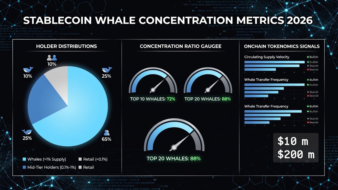
Stablecoin whale concentration has emerged as a critical onchain signal for evaluating token sustainability. As blockchain networks mature, large holders—often called whales—can significantly influence liquidity, peg stability, and overall market dynamics. This article explores how to extract and interpret whale distribution data, concentration ratios, and transfer patterns using 2026 blockchain analytics tools. Investors increasingly recognize that concentrated holdings in a small number of addresses can create systemic risks, particularly when those whales coordinate movements or react to macroeconomic events.
Whale activity often precedes shifts in market behavior. High concentration among few addresses may signal risks to decentralization, while balanced distribution supports resilience. Investors and analysts now rely on real-time onchain metrics to build risk assessment frameworks that incorporate historical patterns from previous market cycles. Understanding these dynamics helps DeFi participants anticipate volatility and protect positions in protocols that rely on stablecoin liquidity.
Extracting Large-Holder Distribution Data
Begin by querying blockchain explorers and analytics platforms for holder distribution. Tools like Etherscan provide address-level data for major stablecoins such as USDT and USDC. Focus on top 100 or top 500 holders to calculate concentration ratios. Advanced users can leverage API endpoints to pull historical snapshots and compare distribution trends over multiple quarters.
Key steps include exporting CSV data from analytics dashboards, filtering for exchange and contract addresses, and normalizing by total supply. This reveals the percentage of tokens held by the largest entities. Analysts should also account for wrapped versions and bridged tokens across Layer-2 networks to avoid underestimating true concentration. Regular data pulls at consistent intervals, such as weekly, allow for the construction of time-series visualizations that highlight accumulation phases.
Interpreting Concentration Ratios
Concentration ratios such as the Gini coefficient or the share held by the top 10 addresses offer quantitative insights. A Gini score above 0.8 often indicates high centralization. In 2026, analysts cross-reference these with transfer velocity to detect accumulation or distribution phases. Additional metrics include the Nakamoto coefficient, which measures the minimum number of entities needed to control over 51 percent of supply, providing a direct decentralization gauge.
Real-world examples from USDC show lower concentration compared to older stablecoins, correlating with stronger peg performance during volatility events. USDT, by contrast, has historically exhibited higher top-holder dominance, requiring more nuanced interpretation when combined with reserve composition data. Practitioners often create custom scripts that flag when the top-20 addresses exceed 55 percent of circulating supply, triggering deeper investigation into wallet identities and historical behavior.
Monitoring Transfer Patterns and Whale Movements
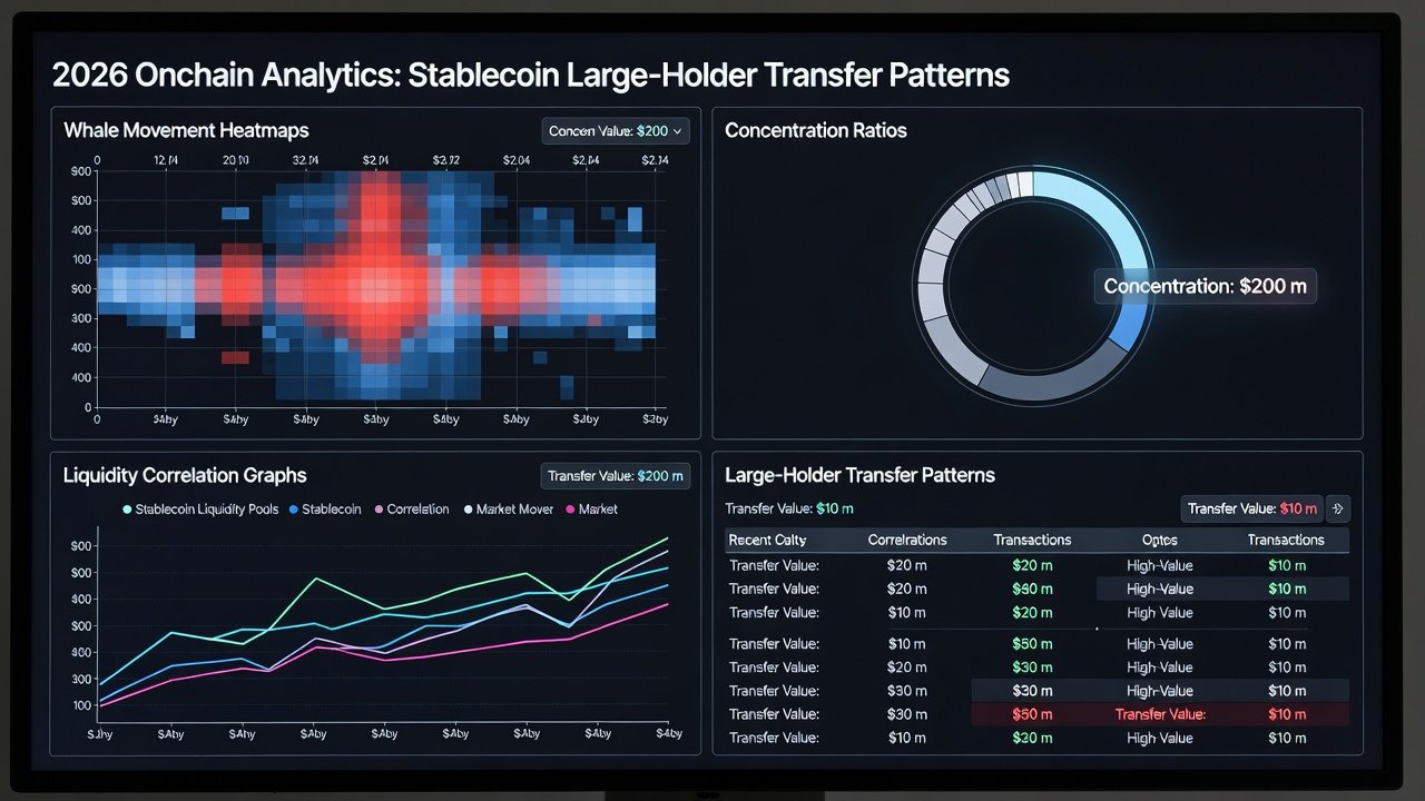
Transfer patterns reveal intent. Large inflows to exchanges may foreshadow selling pressure, while movements to cold wallets suggest long-term holding. Use APIs from platforms like Dune Analytics to set alerts on threshold transfers exceeding $10 million. Clustering analysis can further identify whether multiple large addresses belong to the same entity or coordinated group, improving signal accuracy.
Practical monitoring involves creating custom queries that track wallet clusters and label known entities. Integrate these signals into dashboards that overlay whale activity with liquidity depth metrics from DeFi protocols. Users should also monitor cross-chain bridges, as stablecoin movements between Ethereum, Solana, and newer Layer-2 solutions often precede liquidity shifts in specific ecosystems. Setting up automated reports that summarize daily whale flows helps teams stay ahead of potential market impacts without constant manual review.
Advanced practitioners combine onchain data with offchain signals such as regulatory announcements or issuer attestations. This multi-layered approach reduces false positives and provides context for otherwise ambiguous large transfers.
Real-World DeFi Examples and Correlations
Major stablecoins demonstrate clear correlations. For instance, spikes in whale transfers have historically preceded temporary depegs in less liquid markets. Liquidity depth on decentralized exchanges serves as a buffer, but concentrated holdings can amplify slippage during stress. In one 2025 case involving a major lending protocol, a cluster of USDT whales moved over $200 million to exchanges within 48 hours, resulting in a brief peg deviation that affected borrowing costs across multiple platforms.
Case studies from 2025-2026 highlight how USDT whale movements impacted borrowing rates in lending protocols. Analysts now track these alongside onchain velocity to forecast sustainability. Similar patterns appeared in USDC during regional banking stress periods, where lower concentration helped maintain tighter peg stability compared to competitors. DeFi protocols that monitor these signals in real time have implemented dynamic collateral requirements, adjusting loan-to-value ratios when whale concentration metrics breach predefined thresholds.
Risk Assessment Frameworks and Actionable Dashboards
Build a framework that scores whale concentration against peg deviation and reserve transparency. Include metrics like the Herfindahl-Hirschman Index for holder diversity. Effective frameworks also incorporate velocity ratios and reserve attestation frequency to create composite risk scores that can be tracked over time.
Recommended dashboards combine data from Dune Analytics, Etherscan, and Chainalysis. Set thresholds for alerts when top-holder share exceeds 40 percent or when large transfers cluster around known events. Teams can further enhance dashboards by integrating price oracle feeds and liquidity pool depth from major decentralized exchanges to visualize how whale activity correlates with execution slippage.
Regular backtesting of these frameworks against historical depeg events improves their predictive value. Documenting alert outcomes and adjusting parameters quarterly ensures the system remains relevant as market structures evolve.
Practical Steps for Ongoing Monitoring
1. Establish baseline concentration metrics for each stablecoin you track.
2. Automate daily data exports and store them in a time-series database.
3. Configure multi-channel alerts that include both onchain thresholds and external news triggers.
4. Review and recalibrate risk models every 90 days using recent whale activity data.
5. Share summarized findings with portfolio managers through standardized reports.
FAQs on Interpreting Alerts and Tokenomics Integration
How do I set up whale movement alerts?
Configure webhook notifications in analytics platforms for transfers above a defined size. Combine with liquidity pool data for context and test alerts in a staging environment before deploying to production systems.
What signals indicate unsustainable concentration?
Rising top-10 holder share without corresponding utility growth often flags risks. Cross-check against reserve attestations from issuers and monitor for sudden changes in transfer velocity that deviate from established baselines.
Can these metrics integrate into broader tokenomics evaluations?
Yes. Pair whale concentration with supply issuance schedules and collateral ratios to form a holistic view of long-term viability. This integration supports more robust scenario planning and stress testing for DeFi strategies.
By mastering these onchain signals, participants can make informed decisions in the evolving stablecoin landscape of 2026 and beyond.
No comments yet. Be the first!